Key Takeaways
- Use the 60:30:10 rule to balance the colours in your wedding decorations.
- Match palettes to your venue and time of day.
- Pastels and warm neutrals suit daytime; jewel tones suit evenings.
- Keep one anchor shade across all functions for a cohesive look.
- Finalise your colours early and share them with all your vendors.
Choosing colour combinations for your wedding decor? This guide pairs proven palettes with themes and functions, shares the 60:30:10 balance rule, and shows how to carry one cohesive colour story from haldi to reception without costly vendor mismatches.
Ever walked into a wedding venue and felt the mood before you noticed a single flower? That’s colour doing its quiet work. At Aikyamm, our team has planned 300+ weddings across India over 8+ years, and we’ve seen the right wedding decor colour combinations shape everything, from the mandap to your photos.
How To Choose The Right Wedding Decor Colour Combination
Consider Your Wedding Theme, Venue And Function
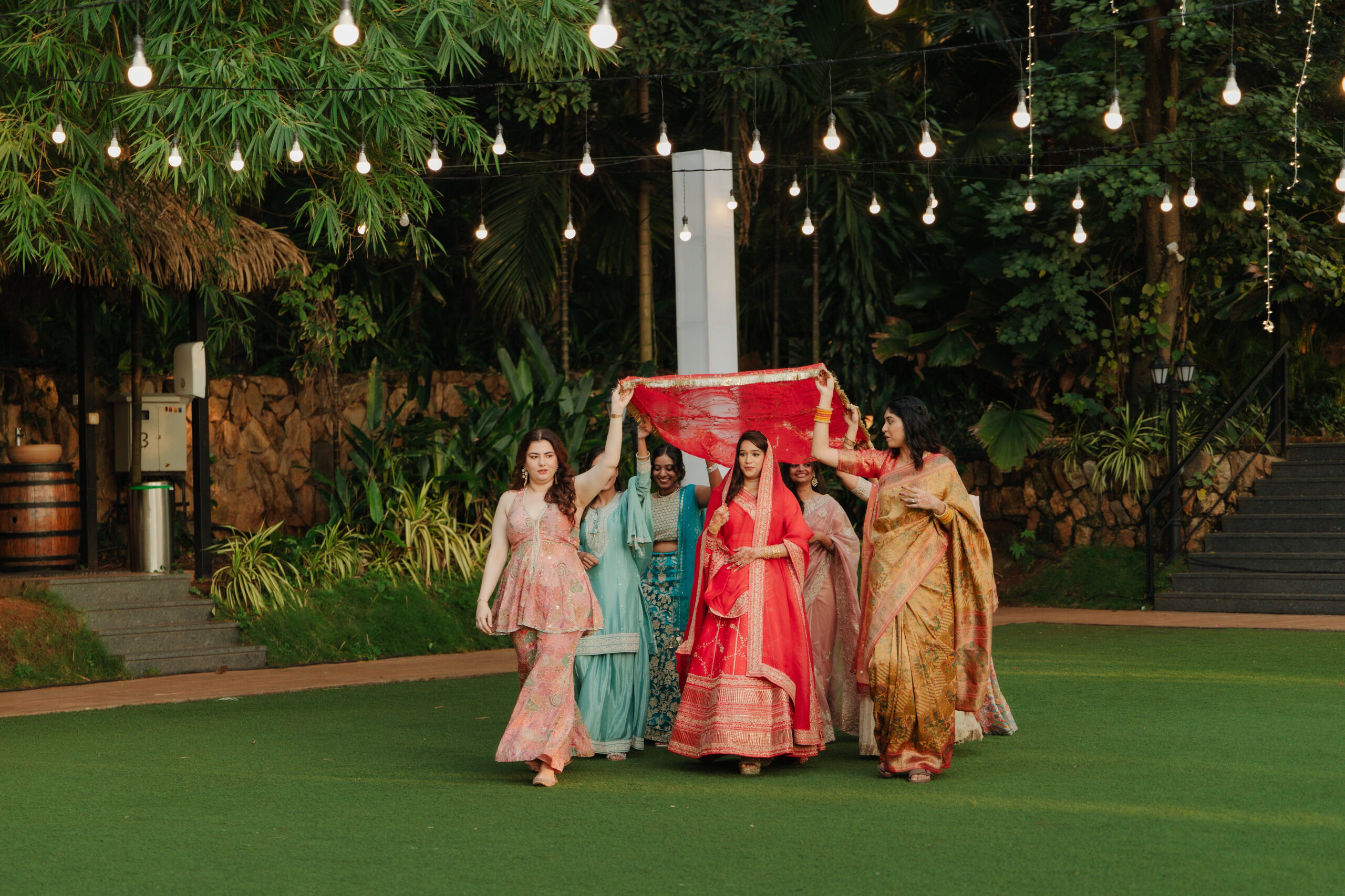
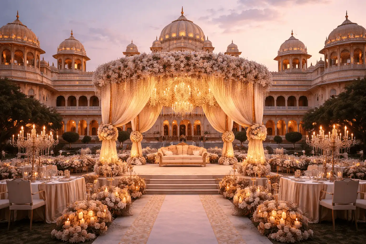
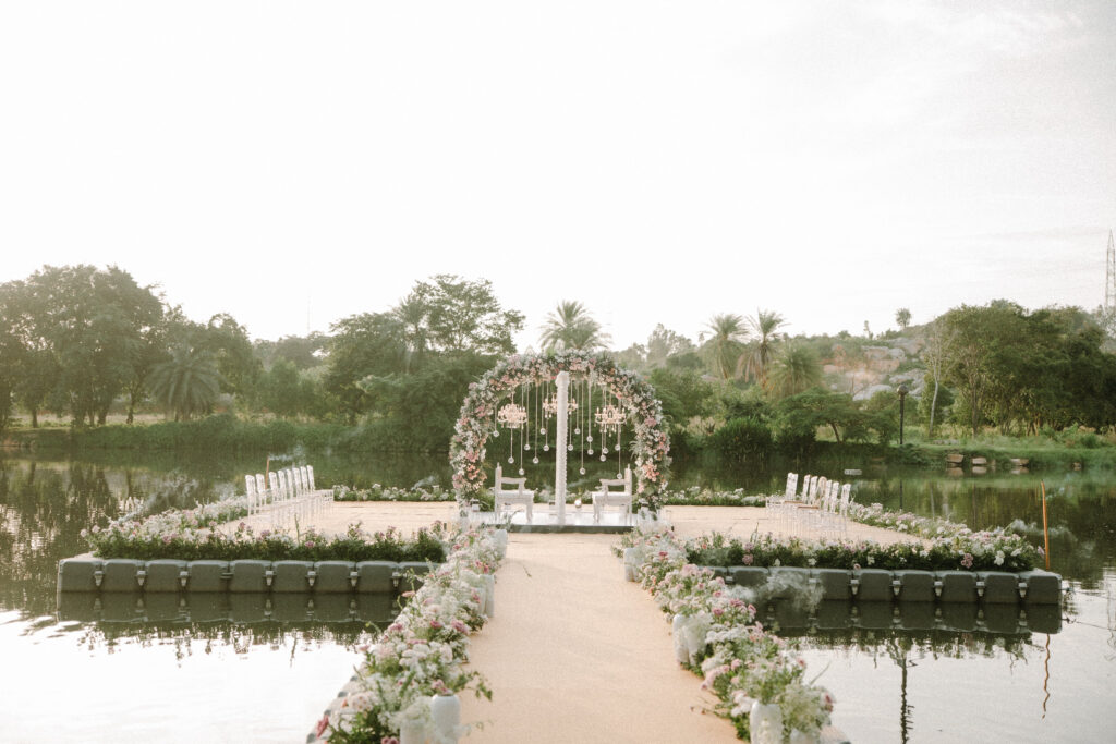
A heritage palace brings its own stone and gold tones, while a garden lawn hands you a green backdrop for free. Your wedding colour palette should work with the venue, not fight it.
A daytime wedding loves soft, light shades, while an evening wedding can carry deeper jewel tones under warm lighting.
Balance Primary, Secondary And Accent Colours
Here’s the rule designers rely on: 60:30:10. Your main colour covers about 60% of the decor, one or two secondary shades take 30%, and an accent, often a metallic like gold or silver, fills the last 10%.
It sounds technical, but it’s freeing. Once the ratio is set, creating colour combinations for wedding decor gets far easier.
Best Wedding Decor Colour Combinations For Different Themes
Blush Pink, Ivory & Champagne For Romantic Weddings
This trio feels soft without being sugary. Think blush garden roses, ivory drapes and champagne candle holders. For 2026, designers favour dusty mauve (#B8889A) and blush (#EDD5D5), which read more grown-up than bright pink.
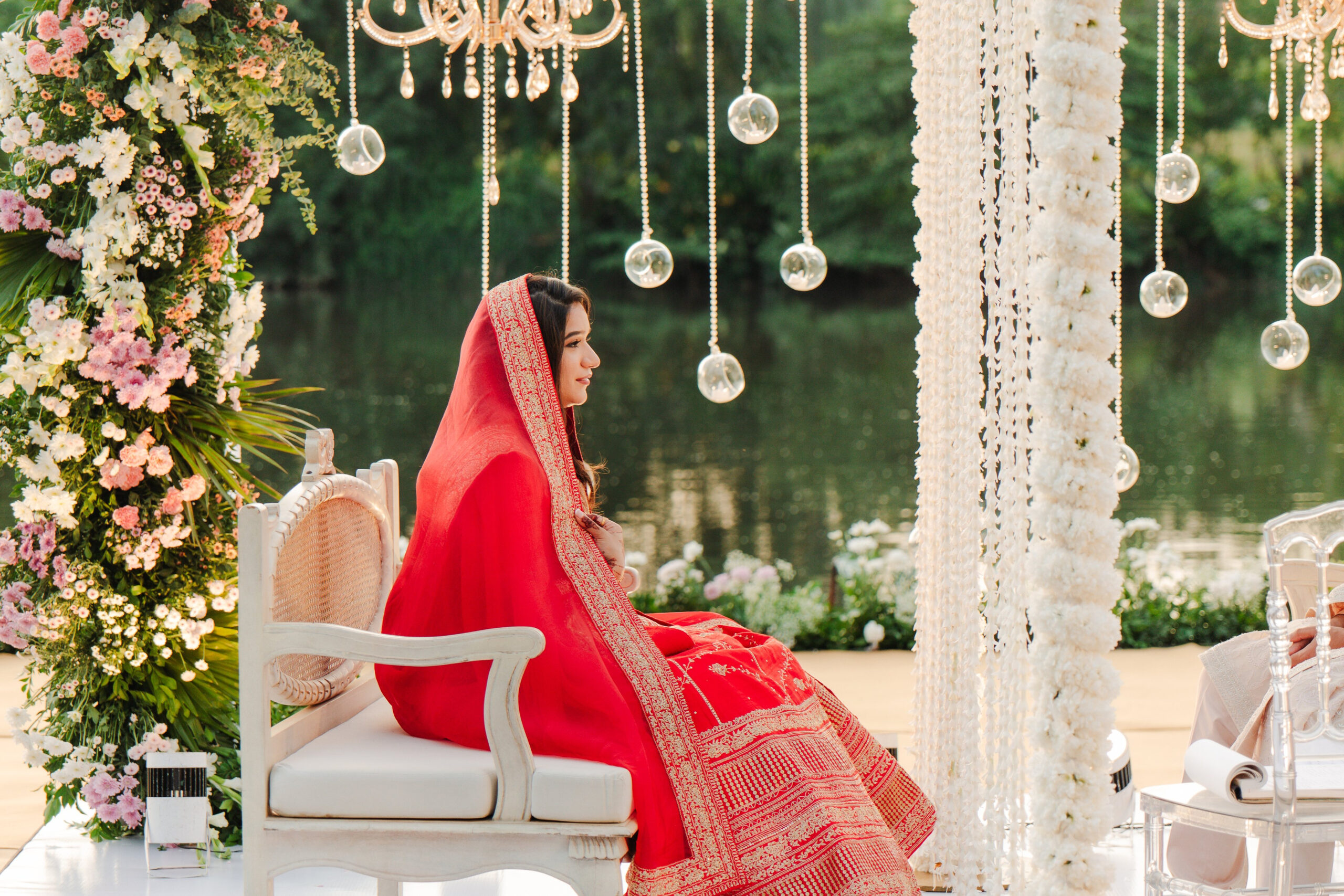
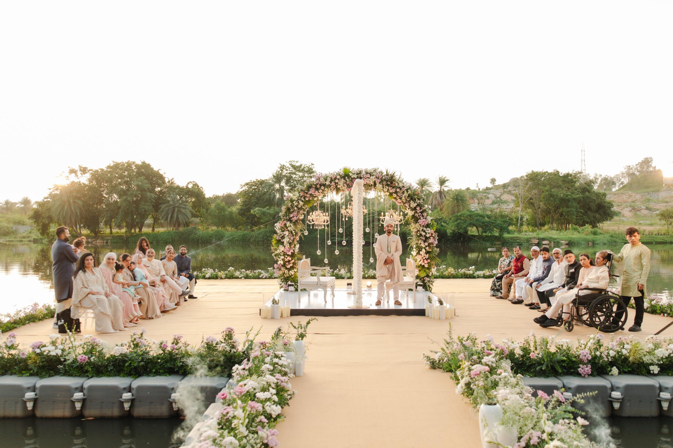
Sage Green, Ivory & Gold For Natural Weddings
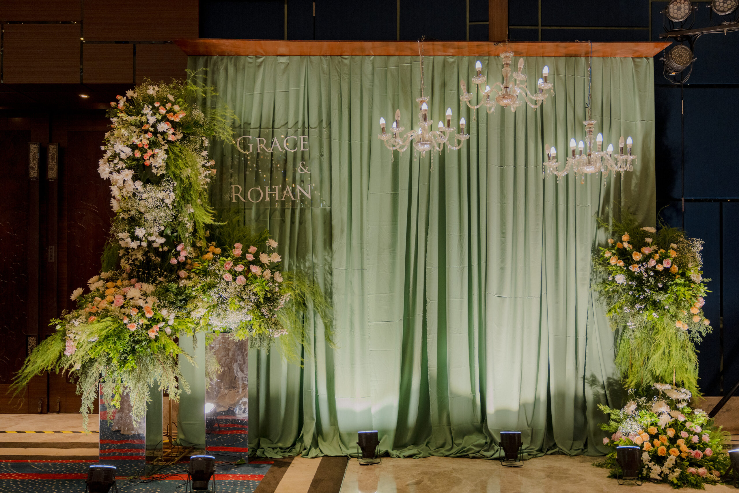
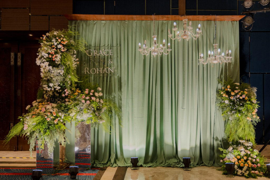
Sage has evolved into a muted, eucalyptus-like tone. Paperlust’s forecast pairs sage (#8A9E88) with ivory (#F0EDE4) and champagne (#D4B896). It’s a natural pick for an outdoor wedding, especially in open shade or golden hour.
Emerald Green, Gold & Ivory For Royal Weddings
Deep greens bring drama and strong photographic contrast. Pair emerald with gold and ivory for palace or ballroom settings. Pinterest’s 2026 Wedding Predicts report names moody jewel tones as one of the year’s two dominant search trends.
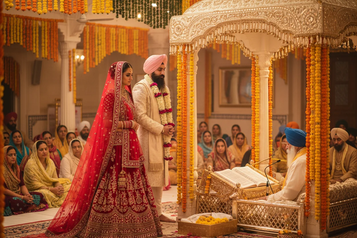
Maroon, Gold & Ivory For Traditional Weddings
It’s a classic for a reason. Maroon carries the richness of Indian wedding decor, gold adds festive shine, and ivory lets both breathe. Use ivory as your 60%, maroon at 30% and gold as the 10% accent.
Terracotta, Peach & Ivory For Earthy Weddings
Warm and grounded, terracotta (#C4663A) works beautifully with pale peach, cream and olive accents.
Lavender, Mauve & Powder Blue For Pastel Weddings
Pastel wedding decor is trending right now. Soft lavender (#C4B8D8) and lilac (#D8C8E8) feel dreamy, while powder blue adds an airy calm. Ever thought about pairing tulle runners with sweet peas?
Wedding Colour Combinations For Different Functions
Haldi & Mehendi
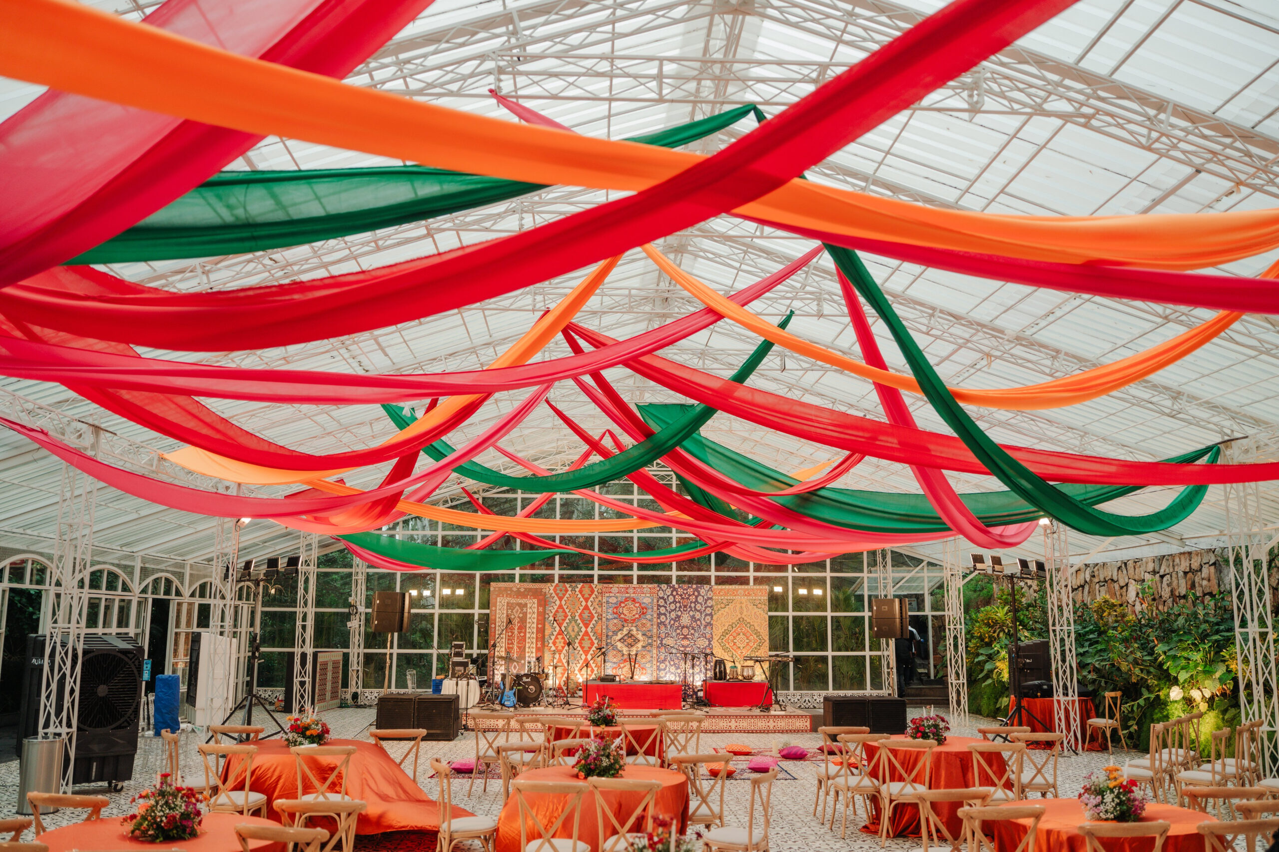
Turmeric yellow is the natural hero for haldi. Pair it with marigold orange and fresh green. For mehendi, butter yellow paired with sage and blush is a fresh, 2026-forward choice.
Wedding & Mandap
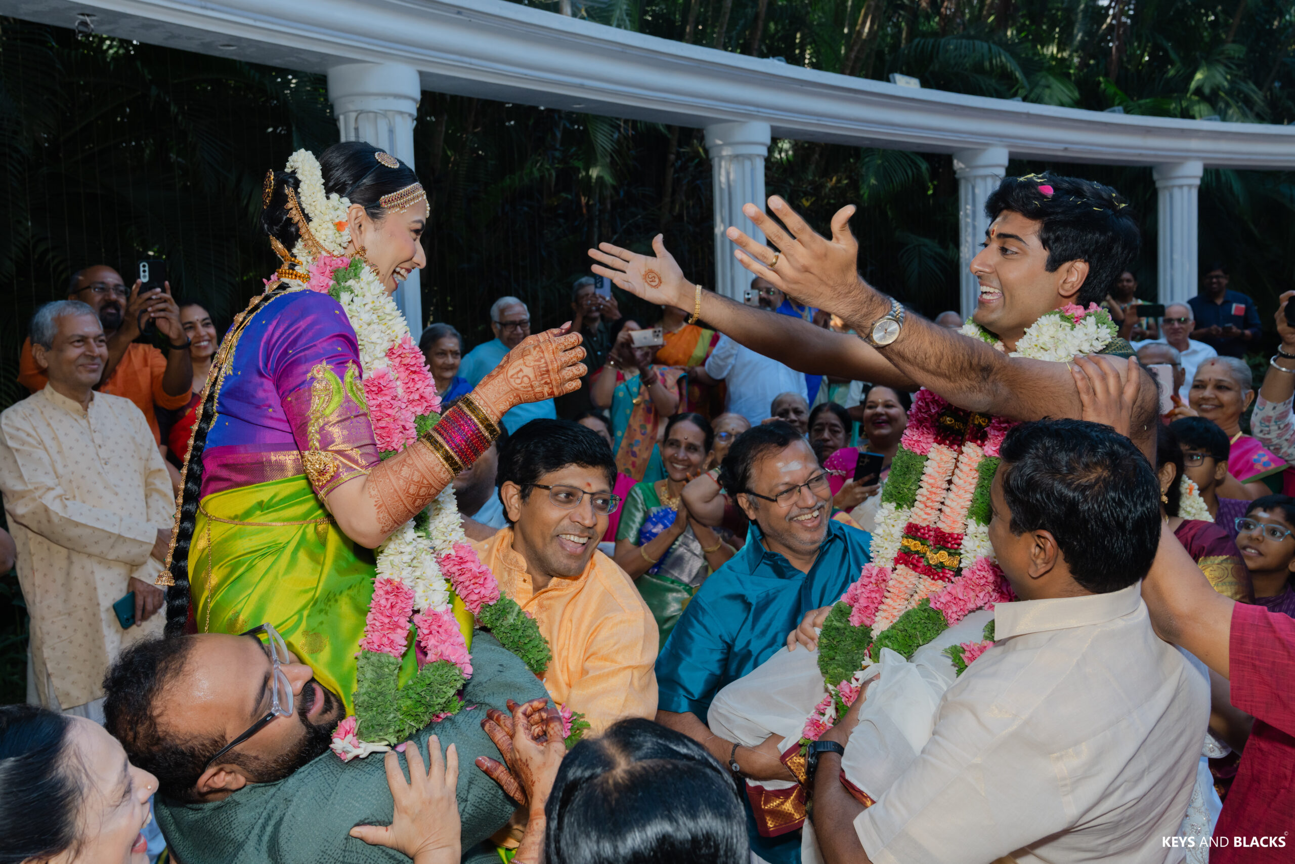
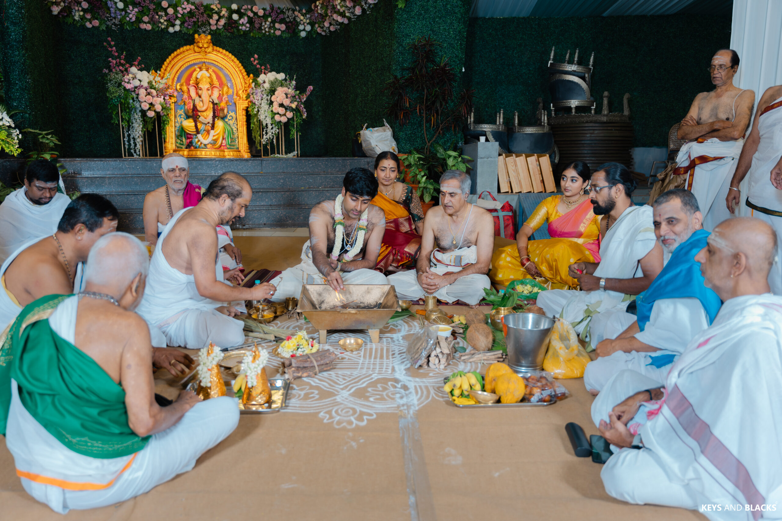
Mandap decor deserves your richest palette. Maroon and gold, or emerald and ivory, read beautifully during rituals. A tip we swear by: bring one fabric swatch from your outfit to every decor meeting. It keeps the mandap and your attire in perfect harmony.
Reception
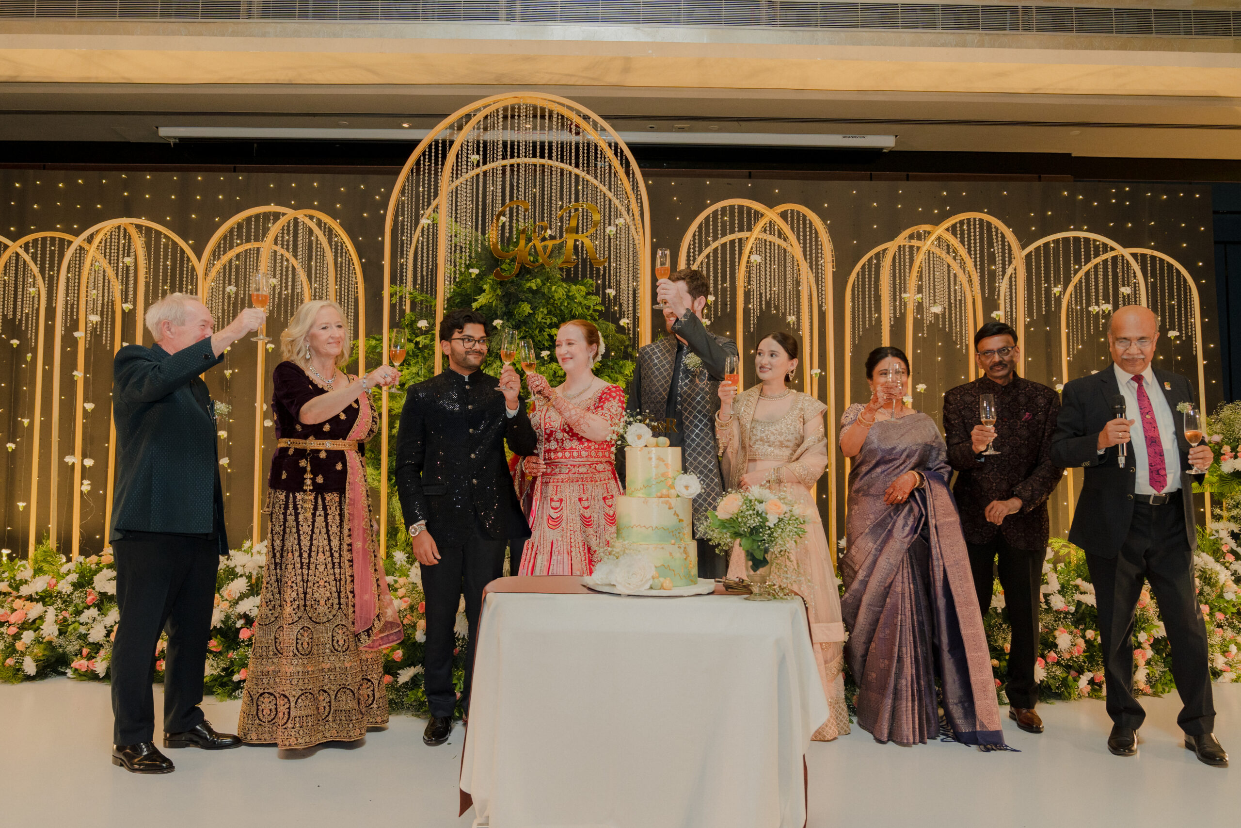
Reception decor is where you can go bold. Midnight navy with gold (#C9A84C) feels black-tie, while deep plum with rose gold creates candlelit romance. Save these darker shades for indoor evening events.
How To Use Colour Across Your Wedding Decor
Mandap, Stage & Backdrop
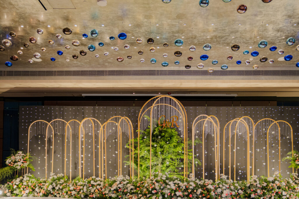
Your stage decor and wedding backdrop frame most of your portraits. Let your dominant colour lead here, then echo the secondary shade in drapes and the accent in metallic frames or lanterns.
Flowers, Tablescapes & Lighting
Floral decor carries your secondary colours best. Repeat them across centrepieces and napkins so the look feels intentional. Warm candlelight deepens jewel tones, while daylight flatters pastels.
Common Wedding Decor Colour Mistakes To Avoid
Even gorgeous wedding decor colour combinations can fall flat with these slip-ups:
- Using too many colours: More than three or four main shades can look chaotic.
- Ignoring the venue: Bold red against a busy carpet rarely photographs well.
- Going dark in daylight: Deep navy or plum can feel heavy against greenery at a daytime ceremony.
- Sourcing vendors separately: Florals, linens and stationery chosen in isolation often clash.
How To Create A Cohesive Colour Palette For Your Wedding
Lock in your wedding decor colours early, ideally before booking your florist or printing invites. Build a moodboard, set your 60:30:10 split and share it with every vendor.
Want each function to feel distinct but connected? Keep one shade constant, like ivory or gold, across every event. That single anchor turns separate wedding colour themes into one story. At Aikyamm, this is exactly how we approach concept and design, so the haldi feels joyful, the pheras feel sacred and the reception feels grand.
FAQs
What are the best colour combinations for Indian wedding decor?
Popular colour combinations for Indian wedding decor include maroon and gold, emerald and ivory, and blush with champagne. These Indian wedding colour combinations balance tradition with elegance.
How do I choose a colour palette for my wedding?
Start with your venue, season and wedding theme ideas. Then apply the 60:30:10 rule across your wedding decor themes.
Which wedding colours are trending in 2026?
Pantone’s 2025 Colour of the Year, Mocha Mousse (17-1230), has carried over into 2026 bridal palettes. Warm neutrals, dusty sage, butter yellow, and moody jewel tones lead the list of wedding decor colours.
What colours are best for a daytime wedding?
Light, warm shades like sage, blush, peach and butter yellow photograph best in natural light. These wedding decor colour combinations stay fresh outdoors.
Which colours work best for an evening reception?
Jewel tones like navy, plum, burgundy, and emerald shine in evening wedding decor, glowing under candlelight, especially with gold or rose gold accents.
How many colours should be used in wedding decor?
Three is ideal: one dominant, one secondary and one accent. Many wedding colour palette ideas stretch to four using a 60-20-10-10 split, but more can feel cluttered.